


When crafting the Bridge Inc. logo, we didn’t just design a visual mark; we created a symbol of interconnected ideas and themes that underpin Bridge—the short story, screenplay, and its philosophical core. Like the narrative itself, the logo was carefully constructed to resonate with layers of meaning, drawing inspiration from science, art, philosophy, and storytelling.
This post explores the creative journey behind the Bridge Inc. logo and the thematic threads connecting its design to the heart of the story.
Inspiration Behind the Logo
At its core, Bridge explores identity, connection, memory, and the blurred line between life and death. The Bridge device serves as the narrative’s focal point, not just facilitating communication but becoming a metaphor for transitions—between people, states of being, and even the boundaries of existence.
The logo design aimed to reflect this interplay of themes while visually tying into the device itself. Its circular and ripple motifs evoke soundwaves, interference patterns, and a sense of far-reaching connection—an apt visual language for a story steeped in both human emotion and speculative science.
Breaking Down the Logo Elements
Basic Circular Logo
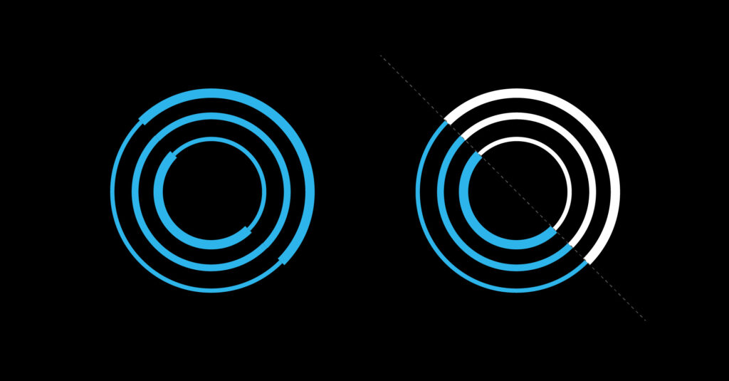
Concentric circles of varying weights form the foundation of the Bridge logo, embodying:
- Ripples and sound waves: Representing the device’s far-reaching impact on human connection, from subtle whispers to resonant voices.
- Reflection and duality: The logo’s inherent symmetry mirrors concepts of life vs. death, self vs. other, and the observer effect, as seen in the double-slit experiment. The interplay between observation and reality is central to Bridge, emphasising how perception collapses possibilities into singular experiences.
This elegant design encapsulates the themes of interconnectedness and duality while reflecting the Bridge device’s ability to blur the boundaries between internal and external worlds.
Typeface and Transition

The Bridge Inc. wordmark utilises the Elza font family in a deliberate progression of weights, transitioning from bold to thin. This gradient reflects the dissipation of sound waves and amplitudes, symbolising the journey from impact to resonance, loud to quiet.
This subtle yet meaningful typographic choice mirrors the Bridge device’s role in transforming whispers into waves of connection and seamlessly blending science, sound, and symbolism.
“B” Version
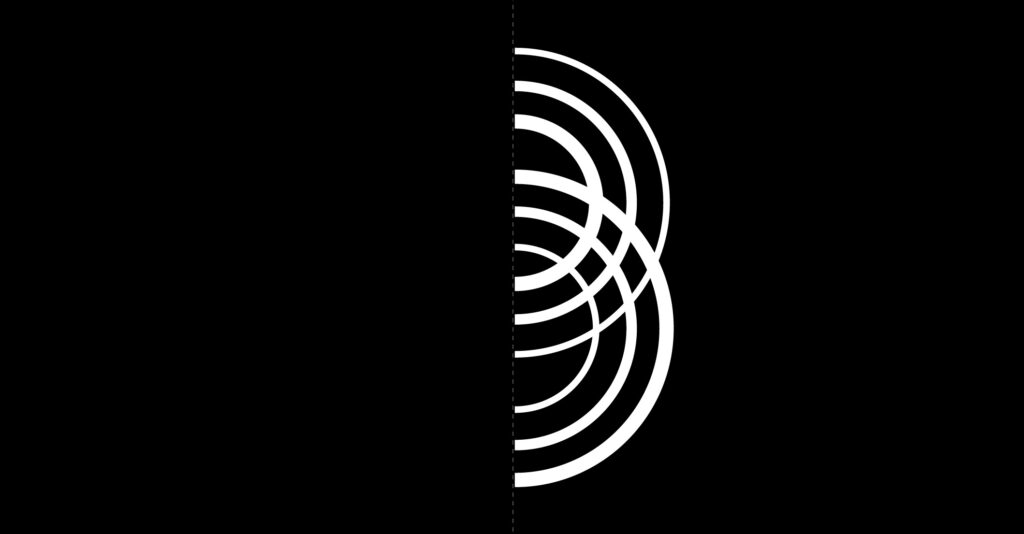
The concentric circles combine to form a “B,” symbolising:
- Interfering waves: Like the ripples in a pond or the patterns seen in the double-slit experiment, the “B” reflects the nature of connection, interaction, and the observer effect.
- Bridge Inc.’s identity: As both a corporate entity and a philosophical construct, the “B” encapsulates the essence of building bridges—between people, ideas, and dimensions.
- The hidden “B-side”: The “B” version of the logo represents the hidden or overlooked aspects of identity and connection, akin to a B-side track. Just as B-sides often reveal rare or experimental works that later gain recognition, the Bridge device metaphorically flips the record of life, uncovering the other side where forgotten voices, emotions, and memories reside.
- Secondary becomes primary: In the story, what is secondary—an AI mimic, fragments of memory—becomes central to Sam’s journey. The “B” version reflects this transformation, emphasising how the Bridge device redefines and elevates what might otherwise be dismissed or unseen.
Bridge Shape

Rotating the “B” version 90° counterclockwise creates the bridge itself, visually representing:
- Crossing thresholds: Between isolation and connection, silence and sound, life and death.
- Narrative arcs: The story’s circular progression, where Sam’s personal journey mirrors the themes of the screenplay.
Blue-Tinted Version

This variation uses overlapping opacities to subtly reflect the depth and complexity of the Bridge device. The design highlights:
- Interference and connection: The amplified overlapping patterns evoke the double-slit experiment, symbolising interaction, observation, and the merging of realities.
- A subtle blue resonance: The blue light of the Bridge device is understated yet profound, a visual metaphor for clarity, connection, and the interplay between science and emotion.
The choice of blue carries layers of meaning:
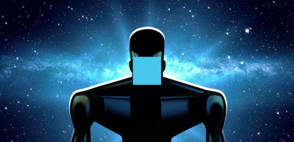
- Hooloovoo Blue: Inspired by Hitchhiker’s Guide to the Galaxy, where the Hooloovoo are described as a “super-intelligent shade of blue,” the color nods to the device’s AI mimic—intelligent, emotive, and almost too real. The subtle rhythm of the Bridge device, reminiscent of the Heart of Gold, bridges the mechanical and the deeply human.
- Zima Blue: Drawing parallels to the Love, Death & Robots episode, where a robot artist pursues meaning through the perfect shade of blue, Bridge uses its light as a reflection of humanity’s essence—its search for identity, connection, and purpose.
- Blue-Shift: In physics, blue-shift signifies light moving closer to the observer. Similarly, Bridge draws voices, memories, and emotions towards Sam, symbolising the collapsing distance between past and present, life and death.
Interconnected Symbolism
Throughout the logo’s design, several key ideas emerged as threads tying the visual identity to the story’s themes:
- Waves and Ripples
From the circular design to the blue waves, the logo is steeped in wave imagery. Whether representing sound waves, interference patterns, or the ripple effect of human connection, this motif speaks to the story’s exploration of how even the smallest interactions can have profound impacts. - Observer Effect
Just as the double-slit experiment collapses possibilities into a single outcome, the story of Bridge reflects on how memory, identity, and connection are shaped by perception. - Heartbeats and Machines
The rhythmic pulse of the device is echoed in the circular forms, bridging the mechanical and the human. The logo’s evolving weights—from heavy to light—mirror this transition, much like the journey of Sam’s connection to her father. - Philosophical Resonance
The logo draws from ideas that permeate the story: the fluidity of identity (Heraclitus’ “You cannot step into the same river twice”), the blending of technology and humanity, and the search for meaning in the face of loss.
A Story Beyond the Visual
The Bridge Inc. logo is more than a brand mark; it’s a visual encapsulation of Bridge’s themes. By combining artistic and scientific inspirations with a narrative-driven approach, the logo not only reflects the story’s essence but also invites viewers to explore its deeper philosophical layers.
Just as the story of Bridge serves as a bridge between past and present, human and machine, the logo acts as a bridge between the story and the audience—extending its ripples far beyond the page or screen.


Leave a Reply